Dremio Workshop > Exploring the Dataset in Tableau > How Does Month Impact Surcharge
- Clear your Tableau sheet by pressing the button on the Tableau toolbar and selecting “Clear Sheet” .
- Now you are going to examine how each month of the year impacts the surcharge of a taxi ride. To do this first you are going to drag “Pickup_Date” to the columns bar and select Month from the drop down.
- Now drag the surcharge measure to the rows bar. Tableau automatically selects the Sum of the records. For this lab, we want to see the total amount of Surcharge dollars spent so we will keep it at sum.
- Tableau automatically choose the line chart for this visualization but we want to see this as a bar chart. Under the Marks box, click the dropdown menu next to Automatic and select “Bar”
**Remember we are looking for the sum for each month not a month over month comparison**
Now that you have a measure and dimension you should see a chart that shows the sum of surcharge by each month.
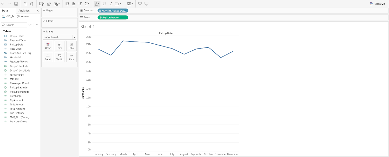
 Your visualization should look like this:
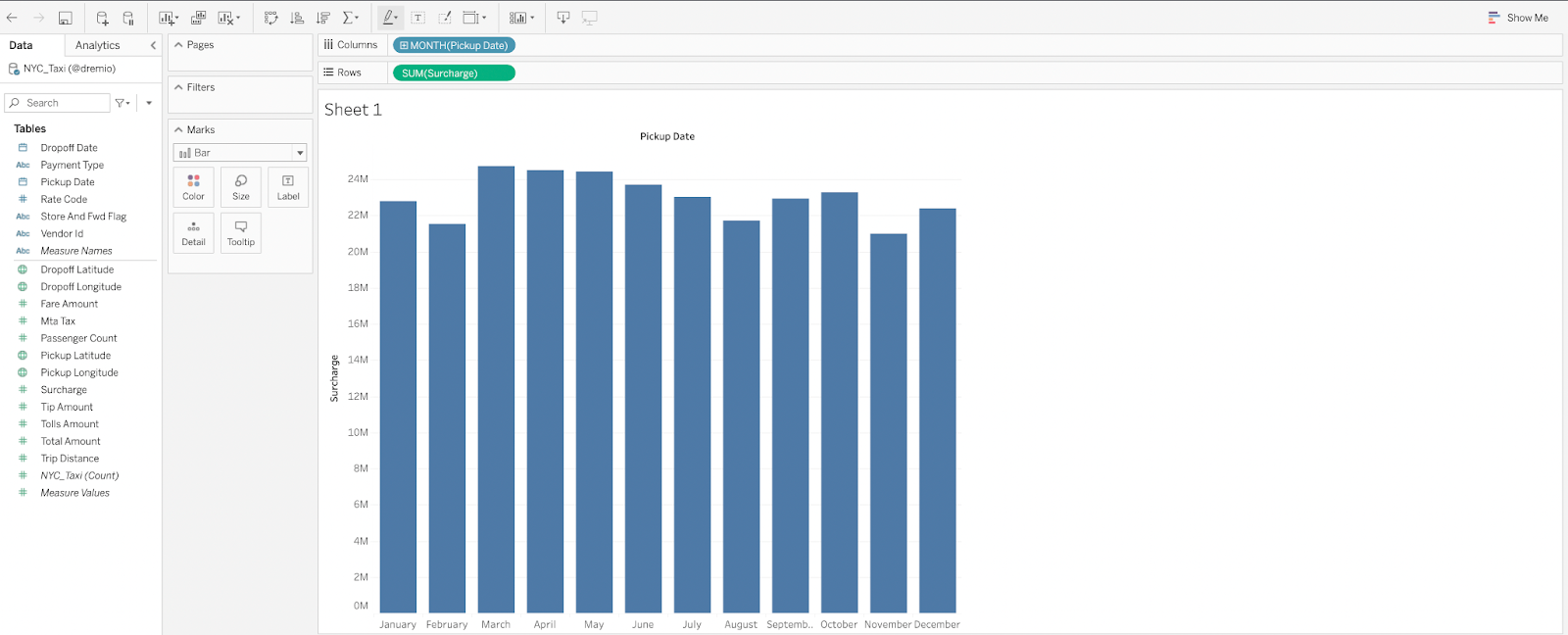 Which month is the highest for Surcharges? March